Spotify UI Clone with Flutter
Hi everybody!
In this post, we are going to clone feed Spotify UI.
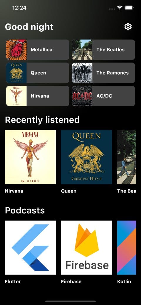
This exercise includes many useful widgets like SingleChildScrollView, BoxDecoration, horizontal ListView/Row inside Column using Expanded, and more!.
Let's started!
The first step is to build our last six albums listened to:
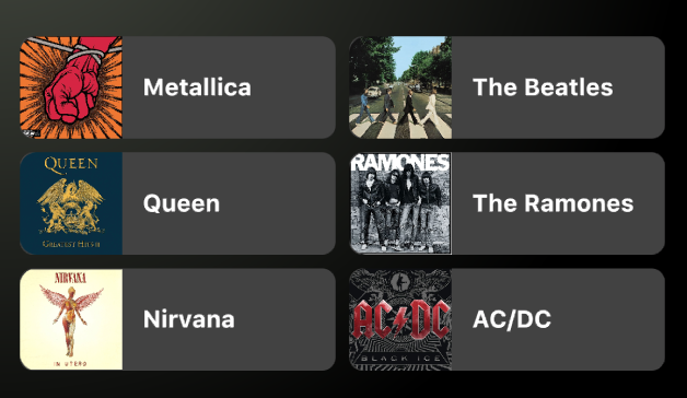
So, I built it using one Row and two Column. Why did I not use a GridView?. Because I wanted to show you Expanded widget. Of course, it's can be built using GridView.
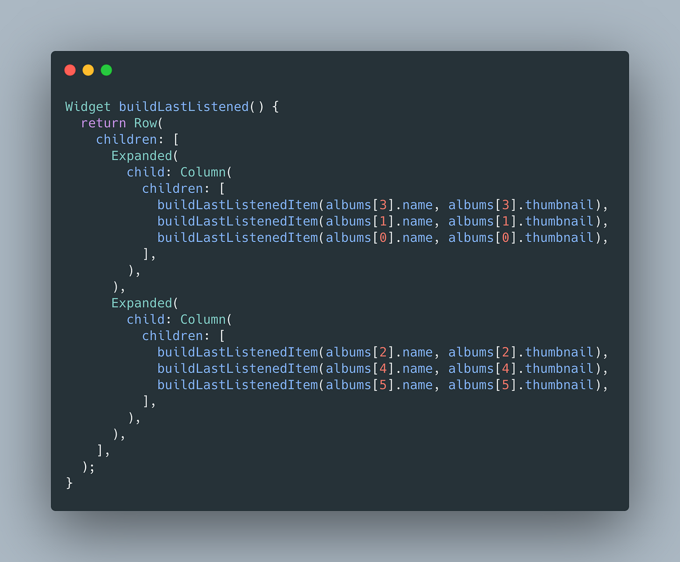
Using Expanded the Column will fill the available space along the Row in the main axis.
If I comment on one of two Expanded widget, the following will happen:
 Using one Expanded widget
Because Expanded says “I have all space for myself, yay!”. But ... Expanded has to live with another Expanded widget, so ... each Expanded has 50% space.
The second step is to build albums recently listened:
 Albums recently listened
I split it into two functions: build album and build list of albums.
Spoiler: podcast section uses build album function too.
 Horizontal ListView
The trick here is in buildRecentlyListened function. When you use ListView inside Column (in this case) or any Flex widget you must specify a height value. Otherwise, you will get an error like:
RenderBox was not laid out: RenderShrinkWrappingViewport#c6a5d relayoutBoundary=up18 NEEDS-PAINT'package:flutter/src/rendering/box.dart':Failed assertion: line 1940 pos 12: 'hasSize'
The third step is to build podcast section. This part is the same of albums with podcast collection instead of album collection.
The fourth step is to build a widget one below another. To achieve we can use Column and set our children. By default, Column is not scrollable, we need to wrap it in SingleChildScrollView to make it scrollable.
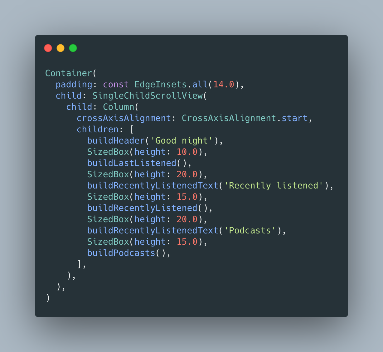 Column scrollable.
In the fifth step and last one, we need to build a beautiful gradient in the left corner of the screen.
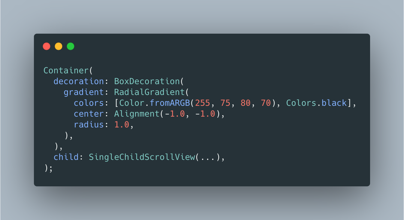 Gradient
We can use decoration property from Container to build a gradient. Our gradient will be a RadialGradient with radius 1 and color from ARGB(255, 75, 80, 70) to Colors.black. And using an official document of Alignment Alignment(-1.0, -1.0) represents the top left of the rectangle.
Finally, we have our build method with all components which we built.

The full code is available on GitHub.
If you want, you can read the previous Flutter articles!.
That's all folks!
Enjoy!